Optimizing Amika's Shopping Experience for Higher Conversions
Overview
Amika, a popular Brooklyn-born hair care brand, faced challenges with user engagement, leading to missed revenue opportunities. We revamped the shopping experience to better align with user behavior, creating a more seamless and intuitive journey.
Addressing Hesitant Shoppers Challenges
At BrandLock, we noticed a recurring issue among Amika’s hesitant shoppers—the shopper group who frequently browsed but rarely converted. The existing shopping experience failed to overcome key psychological barriers, leaving shoppers uncertain and hesitant.
Our challenge was clear: how could we rethink the shopping experience to engage these hesitant shoppers and encourage them to take action without overwhelming them?
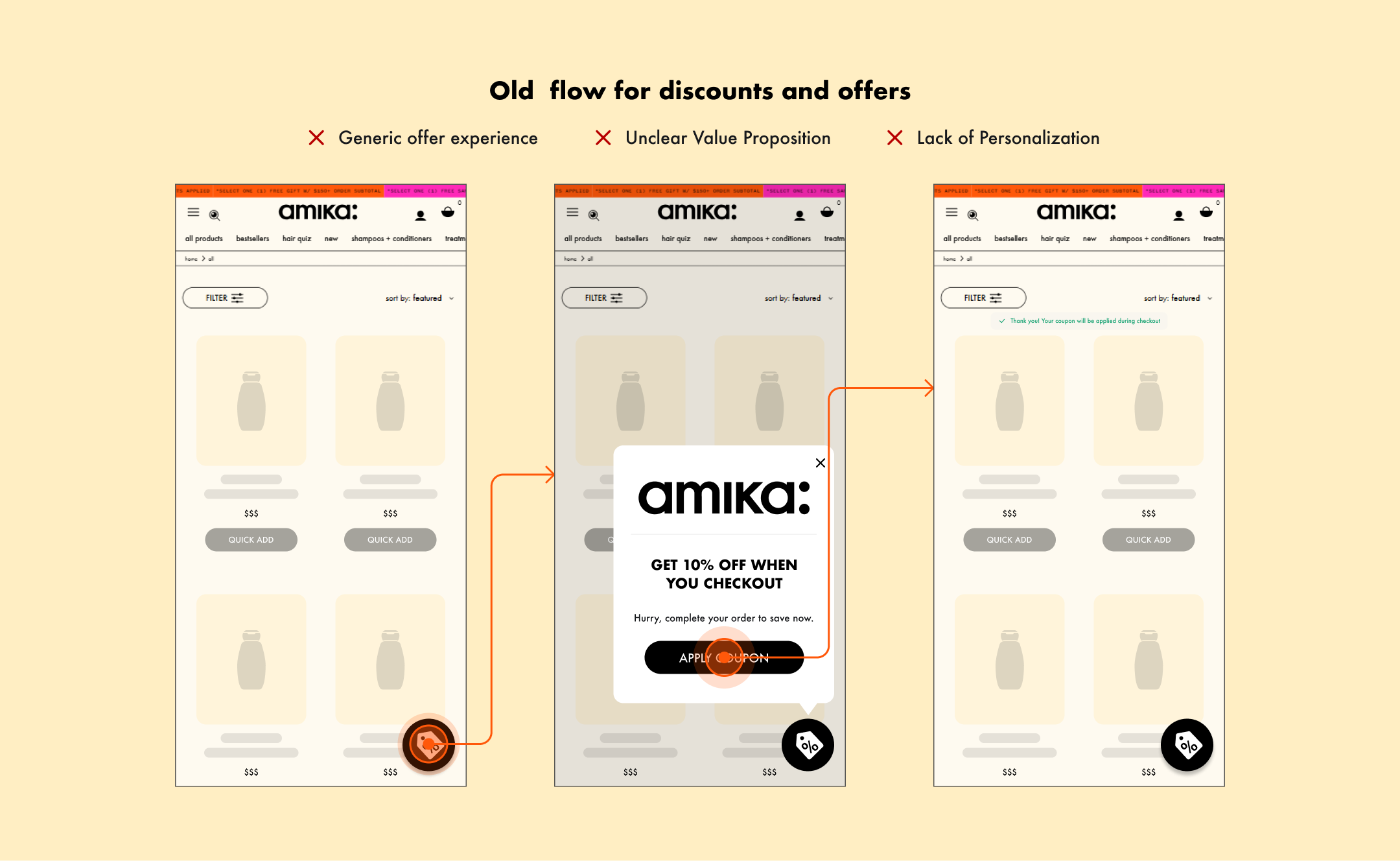 Old flow lacked clarity, personalization, and engagement.
(View image)
Old flow lacked clarity, personalization, and engagement.
(View image)
Finding the Sweet Spot
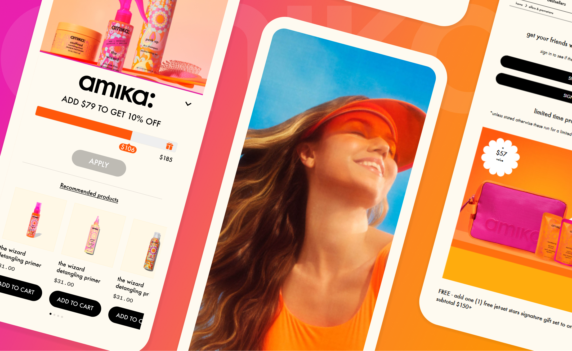
Through research and collaboration, we found a way to make the shopping experience more engaging for hesitant users. By visually showing shoppers how close they were to unlocking exclusive perks, combined with personalized recommendations powered by BrandLock's AI engine, we made the experience more intuitive and rewarding.
The Outcomes:
→ 21% boost in engagement
Personalized recommendations saw higher interactions.
→ 6.33% higher conversions
Conversion rates improved across all shopper groups.
→ 8.67% revenue lift
Hesitant shoppers contributed to a significant revenue increase.
→ 5.83% cart recovery
More abandoned carts were successfully recovered.
Early Red Flags
The initial shopping experience had room for improvement. Customers felt something was missing, but couldn't pinpoint it. Feedback consistently showed frustration with the lack of clarity in the process.
“I don’t know where I stand with the discount—I’m just guessing.”
“I can’t tell what else I need to add to make this worth it.”
We dug into user behavior and gathered feedback, identifying clear pain points that needed addressing to create a smoother, more engaging journey. We tested two design options, A and B, with a group of shoppers and stakeholders at Amika.
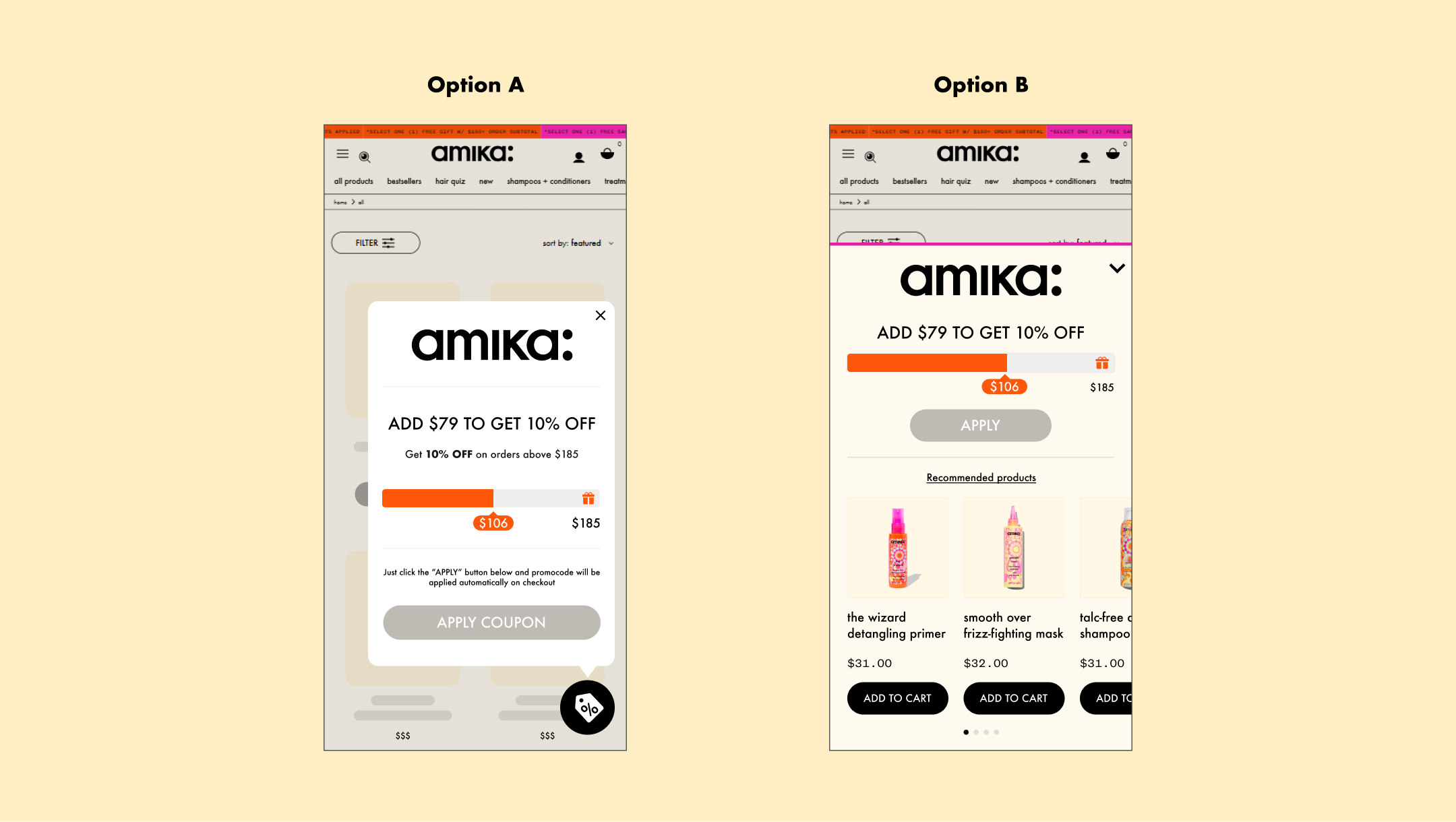 Testing design options A and B.
(View image)
Testing design options A and B.
(View image)
The feedback was conclusive: Option B stood out as the preferred choice, thanks to its clarity and alignment with user needs.
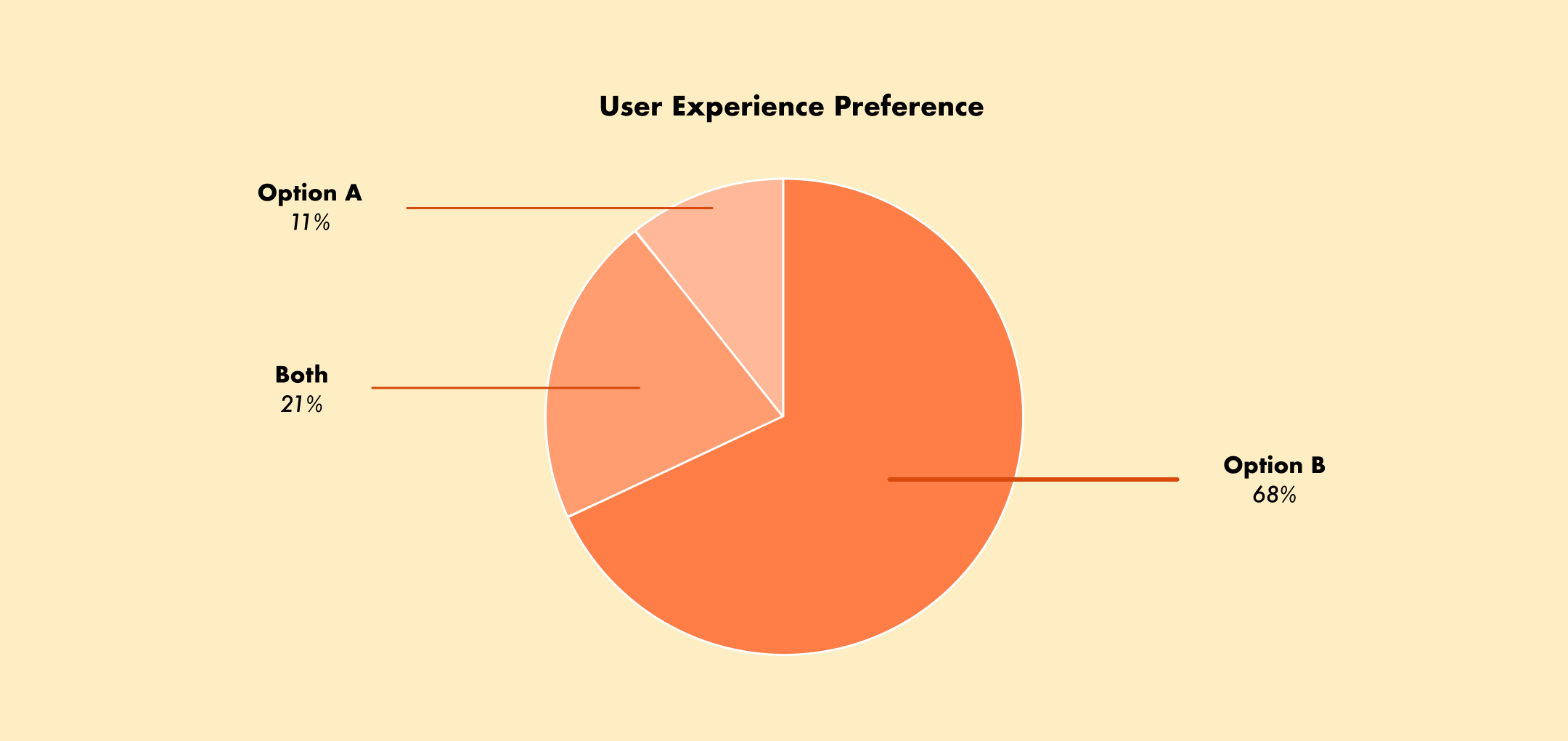 Option B preferred by 68% of users, with 21% liking both.
(View image)
Option B preferred by 68% of users, with 21% liking both.
(View image)
Realizing the limitations of static surveys, we moved forward to refine trigger placements and prototype the solution for its initial rollout.
Testing with Hesitant Shoppers
After finalizing the MVP, we were ready to test it with a select group of hesitant shoppers to understand its real-world performance.
As both the UX designer and researcher, I created the usability test script and an interactive prototype. After presenting these to the stakeholders, the client gave us the green light to move forward with testing.
We focused on understanding:
How the new experience impacted hesitant shoppers
Whether the updated flow encouraged engagement and conversions
With stakeholder approval, we launched the test among 30 users, selected in collaboration with Amika’s team. Using session recordings and direct feedback, we analyzed how users interacted with the new design.
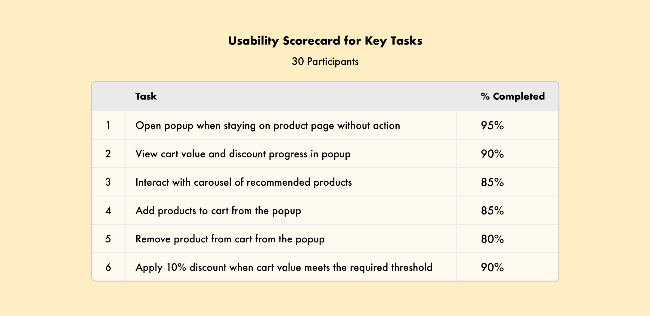 Usability Scorecard: Testing key tasks with 30 users for insights.
(View image)
Usability Scorecard: Testing key tasks with 30 users for insights.
(View image)
Key insights:
Shoppers were more engaged with the new experience, especially the dynamic progress bar and personalized recommendations.
Users also appreciated the "Add to Cart" button, with the flexibility to adjust item quantity or remove products easily.
Based on feedback, we continued refining the experience for better engagement and accessibility.
Perfecting the End-to-End Experience
Based on feedback, I refined the design to follow Amika’s visual guidelines while maintaining consistency with BrandLock’s design system, ensuring a cohesive experience across mobile and web.
Refinements included:
Optimized for mobile and web using Amika’s visual guidelines
Designed prototypes for all device types and edge cases
The team considered all edge cases to ensure smooth functionality across various devices, screen sizes, and browser compatibilities, delivering a consistent and seamless experience.
We were ready for a soft launch!
BETA Launch: A Big Win
After weeks of effort, we released the BETA version exclusively to hesitant shoppers from Amika’s three active shopper groups. The results were exciting—there was a significant increase in user engagement with the popup, showing a positive shift in shopper behavior.
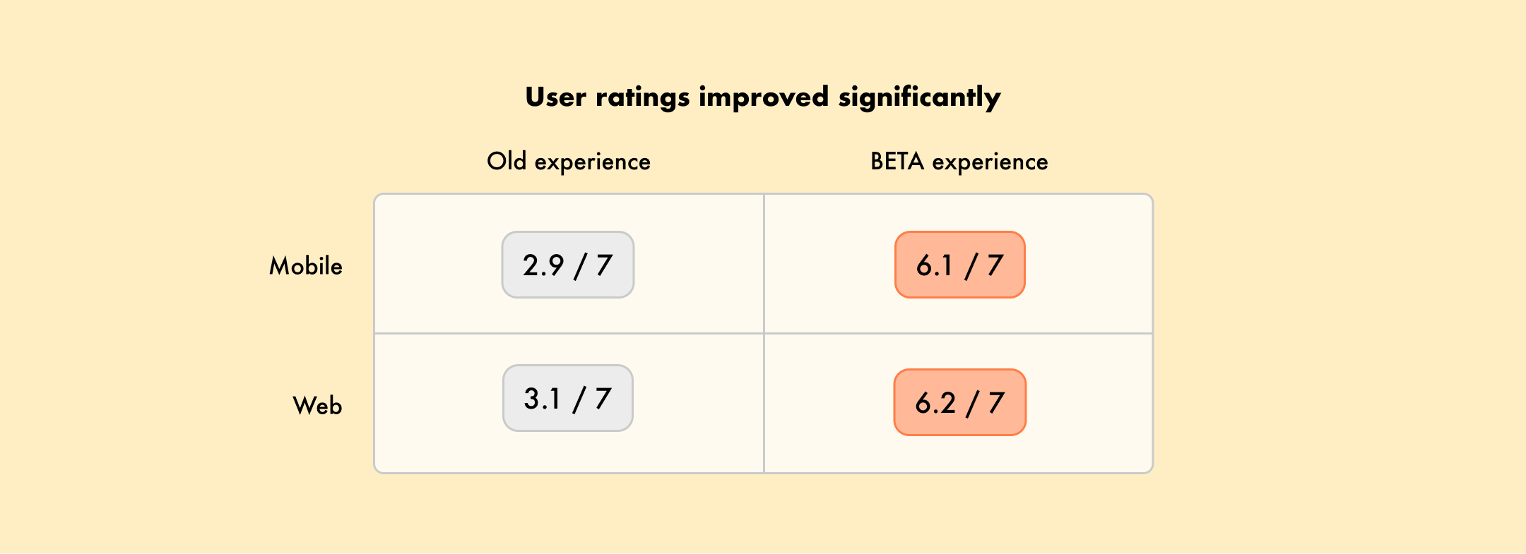 User ratings show significant improvement across mobile and web.
(View image)
User ratings show significant improvement across mobile and web.
(View image)
I worked closely with BrandLock's Project Manager and coordinated with Amika’s team and developers to address feedback and resolve any bugs impacting the user experience.
While the ratings weren’t perfect, most of the lower scores were related to popup-related adjustments that were outside the scope of this project.
We were confident the new experience was ready for the next phase!
A Long-Awaited Launch
After weeks of collaboration and effort, we were thrilled to finally release the new shopping experience to hesitant shoppers!
 The new popup design resulted in a 2-5x increase in shopper interactions.
(View prototype)
The new popup design resulted in a 2-5x increase in shopper interactions.
(View prototype)
With a more visible right-center trigger, we significantly reduced friction. Dynamic elements like personalized offers and progress bars enhanced the experience, leading to higher retention and improved shopper satisfaction. The changes helped reduce hesitation and drove better engagement.