Fortify: Rebuilding Strength in Moments That Matter
Overview
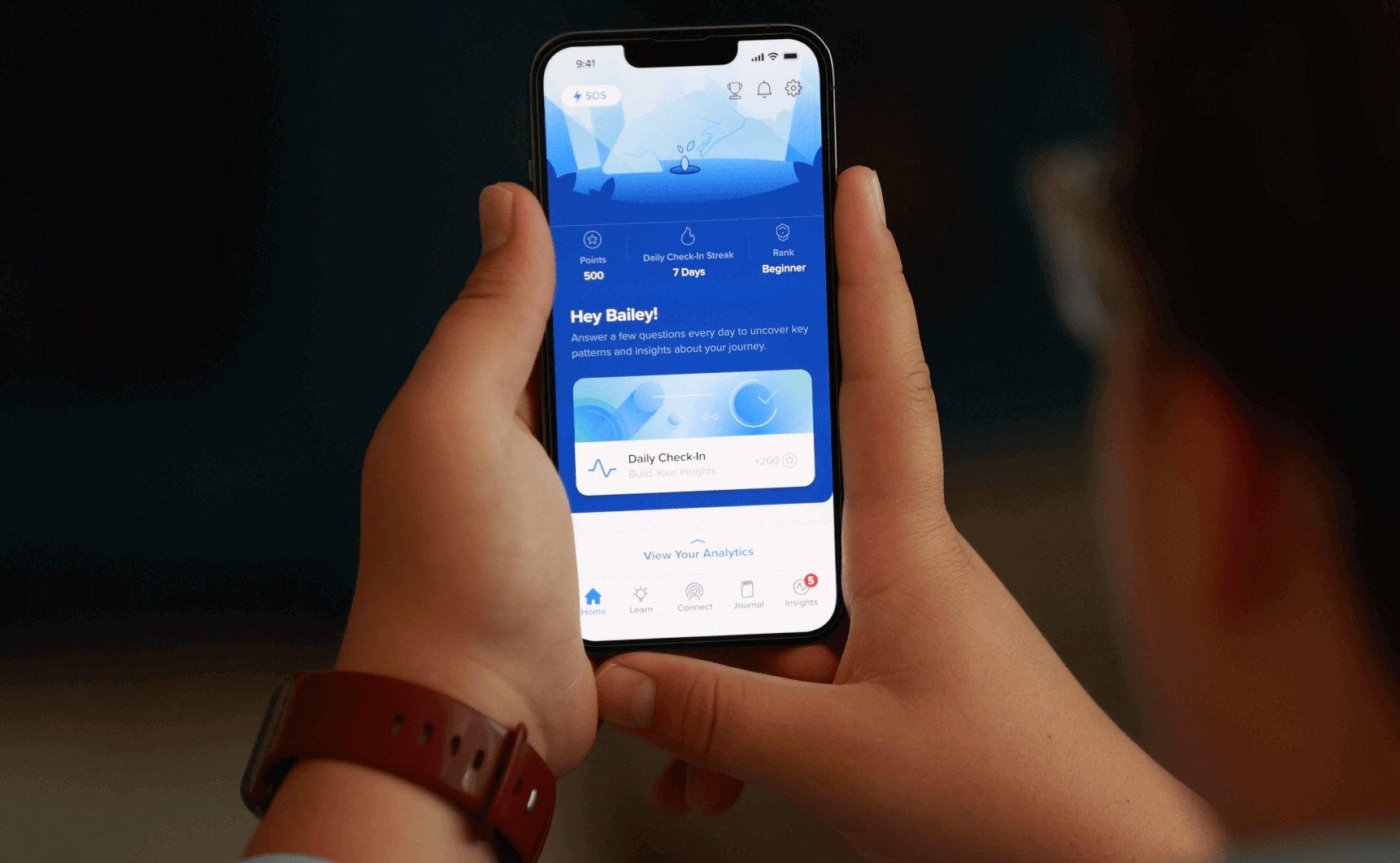
Fortify is a mobile app designed to support individuals in managing compulsive behaviors through daily tracking, educational resources, and community connection. The goal was to create an intuitive, user-centric design that feels both empowering and approachable for users on their recovery journey.
How it started
While at Zibtek, I collaborated with Fortify’s web team during the early stages of the platform. As the product matured, I was brought in to design its mobile experience from the ground up.
This wasn’t just adapting web for mobile. It meant creating a fresh user experience—bringing in new features, improving flows, and shaping a visual system that could grow with the platform.
Softness, clarity, and a space that listens.
Designing with intention
Every part of the app was rethought from the ground up—built not just to function, but to feel right. It had to guide without pressure, support without noise, and grow with the user’s pace.
A clean, calmer interface that invites use
Gestures and flows that feel natural in the hand
Tracking tools that don’t overwhelm
Content that fits into real life, not the other way around
 Every screen designed to feel like support—not software.
A system that holds space
The interface had to feel gentle—open, modern, and human. Rounded corners, subtle gradients, and quiet colors replaced clutter. Every element was stripped down to what felt right.
Soft structure. Quiet confidence. Built to last.
What once felt flat and functional was reshaped with softness—space, pace, and subtlety. Every element was rethought to feel quieter, more human. It had to hold more than features—it had to hold people.
What stayed
Fortify has grown—new tools, new users, and a bigger presence in the space. What began as a focused mobile experience now supports thousands on their personal journeys.
 From launch to impact: Fortify’s evolution and deeper engagement.
And yet, the core hasn't shifted. The quiet tone, the mindful pace, the feeling of support—it’s all still there. The same foundation continues to carry the product forward.
Looking back, it’s not just about what was designed. It’s about what stayed. And I’m glad it still feels the way we intended it to feel.