Case study: Enhanced Gopuff's purchase process
Overview
This case study focuses on enhancing the user experience during the purchase process for Gopuff, an American consumer goods and food delivery company based in Philadelphia. I concentrated on improving usability by analyzing the three most critical KPIs in the delivery experience.

Context
While engaging with design communities and gathering feedback from regular Gopuff users, I identified a recurring issue with the "Add to Cart" button. Many users found it frustrating, impacting their overall shopping experience. Motivated to address this problem, I assembled a group to redesign the button, aiming to enhance usability and streamline the purchase process based on real user feedback.
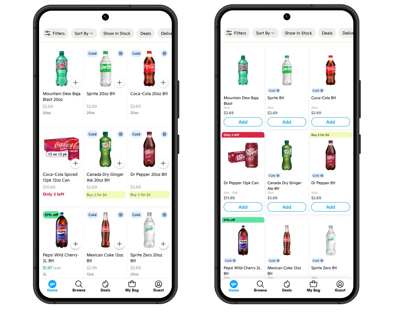 The old design is on the left, and the new design is on the right.
(View image)
UI Design
Wrong Button Position
Placing the button at the top of the product often leads to frequent misclicks during purchases, while positioning it in the bottom left of the product image section results in poor visibility.
The product card has two actions:
Open product details
Add the product to the cart
Many users are unintentionally opening the product details screen instead of adding the product to the cart. This creates significant cognitive friction and becomes a major usability issue when it happens repeatedly during the purchasing process, significantly increasing the total time spent.
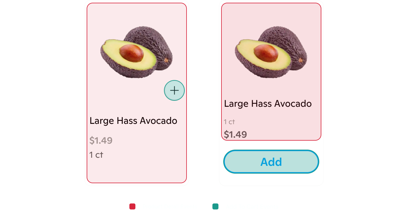 Product information, and add-to-cart events.
(View image)
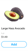
By relocating the Add to Cart (ATC) button, we effectively separate the two zones, preventing users from inadvertently clicking the wrong button. This adjustment reduces friction and enhances the overall user experience.
Undersized
The button is currently too small at 32 pixels considering its critical role in conversions. I always advise adhering to best practices for these types of buttons, which should be at least 44 pixels to ensure they are finger-friendly. This size helps users tap the button accurately without unintentionally touching nearby elements.
 ATC Icon button vs. Newly revamped Round button.
(View image)
Usability
KPIs Definition
To effectively evaluate the usability of my designs, I start by defining the Key Performance Indicators (KPIs) most important to the user experience I'm focusing on.
For an online grocery purchase, three KPIs are crucial to determining the overall user experience.
Taps (Steps needed to complete a task)
States (Phases you encounter while executing a task)
Time (Required to complete a task)
Once the KPIs are established, I conduct a heuristic evaluation to compare the current design with the proposed solution. This allows us to quantitatively demonstrate which design offers better usability.
Heuristic Evaluation
In this heuristic evaluation, the goal is to pinpoint tasks where I can measure predefined KPIs. This will enable me to create graphs and comparisons between the current design I aim to enhance and our proposed new solution.
To illustrate this better, here's an example comparing three key performance indicators (KPIs) related to a common task in online shopping: changing the quantity of a product.
 Three KPIs for the common online shopping task of adjusting product quantity.
(View image)
Data analysis
Defining Events
The next step is to analyze the entire experience where those indicators come into play. At this point, I need to identify the events that can measure the KPIs mentioned earlier, which in this case are:
Add Units (Eg: Eg: From 2 nos. → 3 nos.)
Delete units (Eg: From 4 nos. → 2 nos.)
Remove product (Eg: From 1 no. → 0 nos.)
Massive Analysis
Gopuff has 2.6 million active users in the United States. While I don't have direct access to their user base, I gathered a sample group of 20 participants from my LinkedIn connections and peers who actively use the Gopuff app.
During the interviews, I discovered that most users had difficulties with the design and functionality of the Add to Cart (ATC) button. I provided them with a revamped design and analyzed their feedback in the next phase. Here are some key insights from the session based on the recorded KPIs.
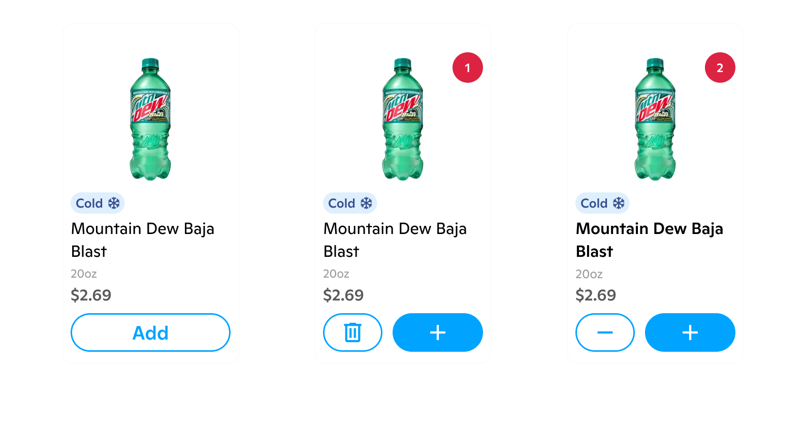 Step 1: The user selects a soft drink. Step 2: They add one unit to their cart, and a red circle shows the quantity as 1. They can also delete the item if needed. Step 3: The user can adjust the quantity up or down as desired.
(View image)
Guerrilla testing
Test Plan
To qualitatively validate this project, I opted to conduct some guerrilla tests. Despite its broad impact, this design change specifically focuses on a critical task: adding and removing products from the cart.
Here are the scenarios and tasks I designed for the tests:
-
"You're doing your weekly shopping and you need to add a few items to your cart"
-
Add 3 units of Dr Pepper 20oz
-
Add 1 unit of Sprite Zero 20oz
-
Add 2 units of Coca-Cola 20oz
-
-
"You realize you need some more Sprite Zero"
-
Add 2 more units of Sprite Zero 20oz (i.e., 3 units in total)
-
-
"In the end, you don't want to buy Sprite Zero or Coco-Cola…"
-
Remove all Sprite Zero units
-
Remove all Coco-Cola units
-
Feedback
#1 Emily Turner, 32 (Salinas, California)
"I could not easily remove the Coke."
"The button was too small."
"The stepper opens and closes when you put the units on, and that makes it very difficult for me."
"I like the design but I find the other one more useful."
"I found this design more comfortable."
"The button is larger, which makes it easier for me to add and remove products."
"This design is clearer to me because the buttons are always accessible."
#2 Ryan Murphy, 27 (Springfield, Illinois)

"I opened the product detail screen by mistake."
"Maybe the button is too small."
"I find it tedious that it is at the top."

"It's much simpler this way."
"I can clearly see how many units I have."
"I can add, I can remove...It's clearer."
"I find it much neater visually."
#3 Ashley Patel, 30 (Edison, New Jersey)

"Sometimes I can't modify units form the product card."
"I don't use the button, I usually open the product screen because the button is too small."
"When I have to make a lot of modifications, I do them from the cart, the product card is very tedious and slow"

"I like it. If I did everything from the card itself it would help me more this design."
"In my case it wouldn't affect me much, but this design is more intuitive."
"I like that the button is bigger."
Takeaway
In this case study on Gopuff’s Add to Cart (ATC) button, I used user research and iterative testing to address key issues. By applying UX principles like clarity, accessibility, and efficiency, I redesigned the button with a larger size and contrasting colors to improve visibility and usability. For future updates, I recommend A/B testing to measure engagement and conversion, along with collecting user feedback to guide further improvements.